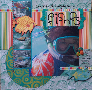
This is a very simple design that highlights a main photo and three smaller supporting photos. This design is great for scrapping beach photos (the focal picture might be the finished sand castle and the three supporting photos are pics of your kids building it, as an example) You can make this design with any coordinating paper that you like. You just need a stripe, a light patterned paper with small prints, a darker coordinating paper with larger print and small bit of coordinating card stock. (this is a great layout to use left overs from other projects). I used the
Scenic Route Grafton papers in the
Scrapbooks Plus Design Team kit for the month of June. My striped paper is "Tyson Street", lighter patterned paper is "Chapman Street". The darker patterned paper used to make the circle and the embellishments is "Wharf Street".
 You’ll need:
1 –12x12 sheet Striped paper
2 different coordinating patterned papers
(one light background, one darker background)
1 sheet coordinating cardstock (8.5 x 11 is fine)
one 6 ½” x 6 ½” photo
three 2 ¼" supporting photos
two medium sized embellishments (flowers, cut design from patterned paper, etc.)
a few buttons, coordinating ribbon (optional)
Cuts:
Striped paper 5”x12”
Darker background patterned paper 6 ½” diameter circle
Card stock 2 ½” x 9”
Assembly Instructions:
1. Use the lighter patterned paper as the background.
2. Adhere the Striped paper 1 ½ “ from the top.
3. Adhere ribbon across the top seam to cover the joint between the papers.
4. Next adhere the circle ½” from the bottom and from the left side.
5. Adhere large photo 2” from the bottom and 1 5/16” from the right side of the background paper.
6. Adhere the cardstock strip flush with the top of the background paper and 1 5/16” from left side of the background paper over lapping onto the large photo.
7. Adhere your small photos with an 1/8” from the top, sides and bottom. You’ll need to leave the space between the first and second photo for the embellishment. (Note, I stitched down the left edge of the photo strip. You can leave it plain, add a different ribbon piece, rub-on stitching, etc. - If your embellishments are busy, leave it bare)
8. Add your embellishments, a little ribbon at the bottom of the photo, a few buttons, title and journaling and you’re done!


